
My job as a Research Software Engineer

I was asked to write about what I do as a research software and data engineer in my work with the SYNC Lab. There are quite a number of resources out there explaining what research software engineers (or RSEs, for short) are and do (see for example 1, 2 and 3). I thought I’d add to that by focusing less on general descriptions and more on some specific tasks and tools that I keep myself busy with. I’ll link to a few of my talks and resources along the way if you’re interested in knowing more about specific topics.
First, a bit of background to give you context. I was trained as a mechatronic engineer (a mix of mechanical and electrical engineering) and I set out to work in the field of biomedical engineering on robotic prostheses. Not being able to find a job in that field, I moved on to industrial automation for a few years, then joined an exciting, small software startup for a few more, and then switched gears to do my PhD in real-time functional MRI signal processing at Eindhoven University of Technology. After that, a year ago, I started my current job as an RSE at Research Center Jülich in Germany, and my part-time position with the SYNC lab in The Netherlands.
From this short history, perhaps it’s clear to you that I was never explicitly trained as a research software engineer (if not, don’t worry, it is very clear to me whenever I struggle with some technical aspects that well trained colleagues can do in their sleep). Perhaps it’s also obvious that I did not follow the expected path of a career-researcher. It’s not like I did my bachelors, masters and PhD all in the same field, finally becoming disillusioned with academia and then applying my true passion of software development in an academia-adjacent position. (A single PhD project, however, is more than enough food for disillusionment :P).
But research software engineering is the job I’ve loved doing the most, and it’s because of the fact that I can use my existing range of skills, hone them on new challenges in the broad field of science that I adore, and solve interesting problems every day, all while working towards improvement that others can benefit from. Not all RSEs have the same makeup. Some are trained and work as software engineers for years, or some happen into the position by chance. Some focus on a specific software language or implementation, for others it might be all about data management or high performance computing. But all of us solve problems in support of our colleagues and the scientific field in general. And, in doing so, we often draw from a set of common skills and focus on similar tasks. For me, these include:
- Research data management
- Developing tools and software for reproducible research
- Visualisation
- Learning and educating
Research data management
Three words to describe something that is best executed by a team instead of by a single person, based on the sheer amount of work this can require. Doing research data management basically means that you build and support systems and practices for managing the full lifecycle of research data: from design to acquisition to processing to publishing to archiving. Where should the data be saved, and in which formats? Are there community standards for structuring the data that we can use? How should we transport the data between storage and computing servers? And when it comes to format or structure conversion, data cleaning, (pre)processing, and scientific analysis: how do we track how the data changes? Can we set up a workflow for decentralised collaboration and contribution? Who did what with the data when and where, and how can we change or revert that if we want to?
The tools I use to do this are easier for me to talk about, since that is the main focus of my job at Research Center Jülich. We develop the free and open source software tool called DataLad, which is a distributed and collaborative data management system supporting arbitrarily large datasets, on-demand content retrieval, dataset nesting, data version control, provenance capture, and metadata management. That’s a lot of jargon that is perhaps better explained by this comic:
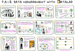 Heunis, Stephan. (2022). F.A.I.R Data Management with DataLad – a comic strip. Zenodo. https://doi.org/10.5281/zenodo.6400523
When I do data management, I mostly use:
- Command line tools (including DataLad) to operate on data in its various formats
- Data storage servers and compute clusters when accessing and processing data, which are almost always on Unix-based operating systems
- Cloud environments for accessing/storing data such as Amazon S3 and GIN
Most of these steps are done via the command line, which, if you weren’t trained in computer science or don’t have years of experience, could make you feel both immensely powerful and dreadfully incompetent at the same time. Luckily, I’ve gotten used to it. I find opportunities to make a fool of myself, and learn, every day…
Developing tools and software for reproducible research
The border between this set of skills and tasks, and the one described above, is very vague. Therefore, I’ve arbitrarily decided to describe the next set of tools in this section and not as part of Research Data Management. However, you’ll often find a very close link between reproducibility and data management, and research engineers are often big proponents of using tools and practices to conduct both efficiently. That’s why many aspects that fall under the umbrella of “open science” often play an important role in our jobs.
In my work with the SYNC lab, especially when working with the multi-modal and longitudinal LCID dataset, I use many open source tools to accomplish my goals for efficient data management and reproducible research outputs. My daily workload consist of a mixture of these tasks and tools:
- Organise neuroimaging data in the BIDS format
- Write and run Python scripts to clean/extract/convert raw data
- Organise, track and collaboratively develop scripts/software with git and GitHub
- Manage datasets, dataset linkage, data transport, and provenance tracking with DataLad
- Use bash scripting for file handling/copying/renaming and general data organisation on a storage server or compute cluster
- Develop and maintain software packages for the analysis of functional MRI data (e.g. fMRwhy)
- Use job schedulers or workload managers (such as SLURM) to run data analysis jobs on compute servers
- Consider data privacy and the GDPR at every step of the data management and analysis workflows
- Decide how to split derived data into those that can be shared and those that cannot
- Host derived statistical images of fMRI data on NeuroVault
- Create publication packages for project material and data, using services like GitHub, Figshare and Zenodo.
- Running computing examples on cloud infrastructure using free and open source tools such as Binder and JupyterHub.
For some more contextual detail on the above processes, you can have a look at this talk where I present and discuss several tools as they apply to code and data sharing in the field of functional MRI:

As you can see from the bullet list above, almost all of these tasks involve some form of software programming or scripting. I despise manual and repetitive tasks, and if there’s even a slight chance that someone might benefit from automation, I’ll probably do it. Luckily, collaborative coding, automation, and data sharing all have loads of other (more important) benefits including improved global access and collaboration, easier error detection, and drawing on the skills and strengths of many (which also address other things that I despise: competition and exclusivity).
Visualisation
An important part of the scientific process is conveying results in an understandable and interesting way, and scientific visualisation has a large role to play here. I am often frustrated by how little we, as scientists and researchers, employ the powerful tools at our disposal. The technology already exists for us to create interactive and engaging visualisations, to turn our results into veritable works of art, yet we often stick to boring graphs published in static formats. Of course, it is not reasonable to expect a single researcher to master all of these skills in addition to conducting actual research and writing journal articles and grant applications. But I guess that’s a good reason why research institutions and labs should hire research software engineers!
When working on scientific data and results, I often create both static and interactive figures to convey things like data quality, statistical measures, and data distributions, mostly as they relate to brain images. For this, I use many tools:
- For visualisations, I mostly work with Python, Matplotlib and Plotly, which is an open source graphing library for Python, R, and JavaScript that provides great forms of interactivity. Have a look at all the pretty plots you can create!
- Plotly’s Dash adds dashboard-like functionality that allows you to design browser-based applications for your scientific data. Here’s an example of a data visualisation application I created for a brain imaging study last year.
- Even without using these tools (and with the benefit of native browser support, i.e. not having to rely on server infrastructure for running code that your application relies on) pure JavaScript and CSS can be very powerful.
- JavaScript frameworks like VueJS or React are also very useful for extending interactivity in the browser.
- When it comes to static images and maintaining high image quality, I mostly work with the SVG format (scalable vector graphics) and I edit images in the free and open source tool Inkscape.
For a demo on using Python, Plotly and Dash to create interactive visualisations and applications, you can check out this video:

There are of course loads more tools and frameworks to use when creating visualisations, for example R, ggplot, and Shiny apps. The ones I mentioned are mainly preference- and experience-based.
Learning and educating
Last but far from least. I think these are the two aspects that I love the most about my job (apart from the fact that being able to create things with code sometimes makes me feel like a magician). I am (1) easily bored with and distracted from something that has the slightest taint of monotony, and (2) easily demotivated from doing something if I don’t understand why I’m doing it (and once I understand why, I have to deem it worthwhile). This is why I love and seek out opportunities for learning new skills and tools, and why I enjoy turning what I learned into an educational resource that can ideally help others.
It is often seen as the boring part of software engineering, but documentation is immensely important to help users to:
- Understand how to use the software
- Find practical examples on which to base their own software workflows
- Find specific technical details about design, usage, outputs and integration
- Know where/how to ask for more help
- Know how they might contribute to the software
That is why much of what I do consists of explaining concepts to others. For documenting software or scripts, I depend largely on the following tools:
- A README file!
- The Markdown markup language, which is a very common language to use when writing a README file for software projects
- The Sphinx tool for auto-generating documentation for a software project (very commonly used with Python packages), along with the reStructured Text markup language used by Sphinx
- Jupyter Notebooks, for interactively presenting code, narrative, and visualisations in the same live document, are very useful when sharing tutorials or educational content.
- Jupyter notebooks and Markdown can be used together to create publish-ready and interactive electronic books with the Jupyter Book framework.
Creating output that is not only interesting, visually pleasing, and engaging, but also educational to the extent that it simplifies the lives of others is reason enough for me to keep doing it.
So that was it. A day in the life of one research software engineer. Hopefully this adds some transparency to what might be opaque to some. And don’t be misled by what is seemingly an impressive list of skills and tools. If I remembered to add an item to a bullet list above, that memory is there because of the associated pain and struggle that it took to achieve it. Struggling is part of our daily lives, and not everything always works out seamlessly with the use of a single tool or trick. It often takes a team of colleagues to solve complicated tasks, just have a look at the issue log of any open source software project. And it takes an immense amount of Googling #noshame.
I didn’t cover all RSE aspects in equal detail, and I probably missed something that could be the very air that some RSEs breathe. But take that as an opportunity to go to your nearest (virtual or physical) research software engineer, buy them a coffee (the fuel for good code), and ask them a bit about what they do 🙂
Contact
Erasmus University Rotterdam
Mandeville Building T13
Burgemeester Oudlaan 50
3062 PA Rotterdam, the Netherlands